CLUB SOLUTIONS MAGAZINE
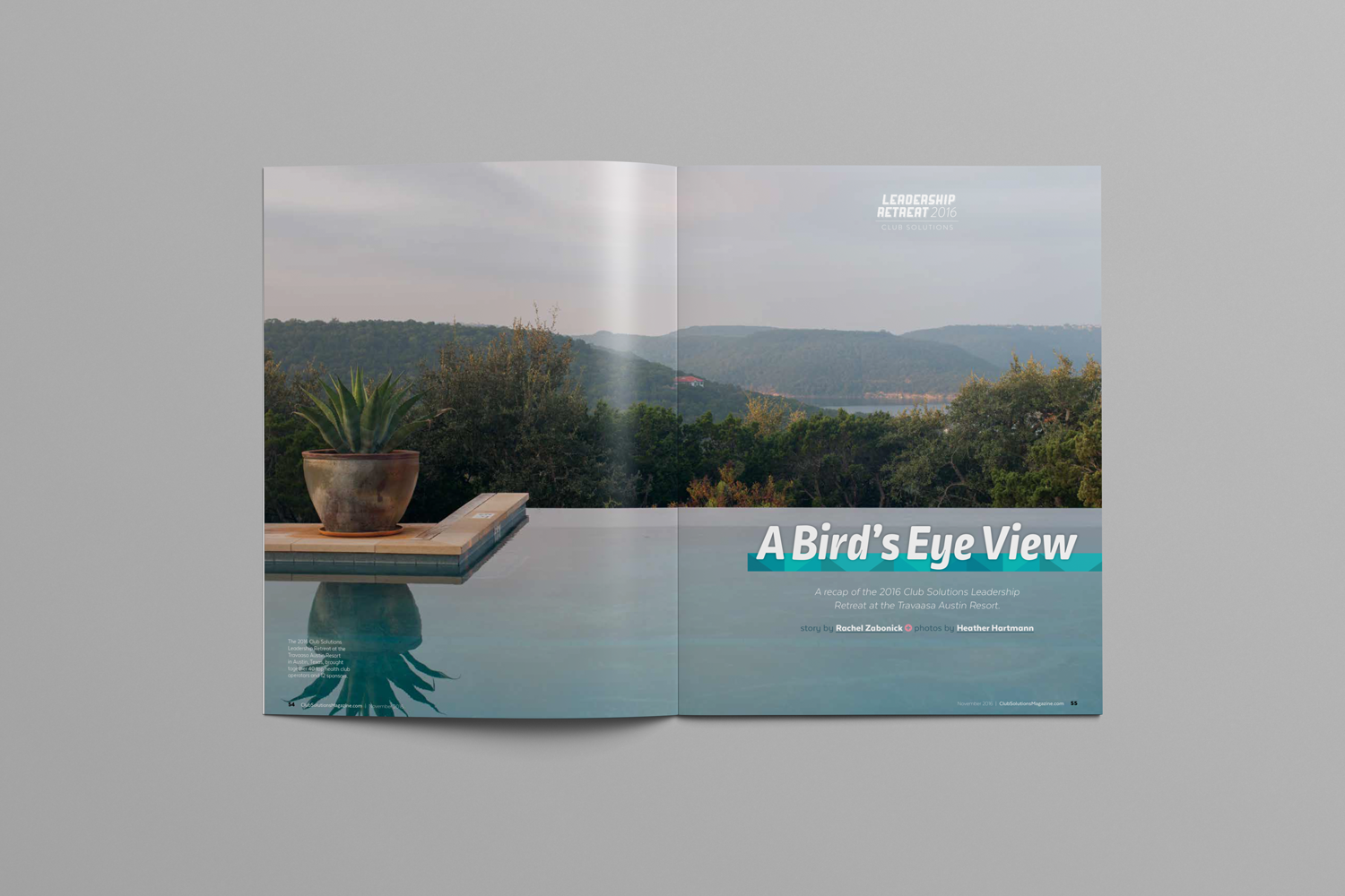
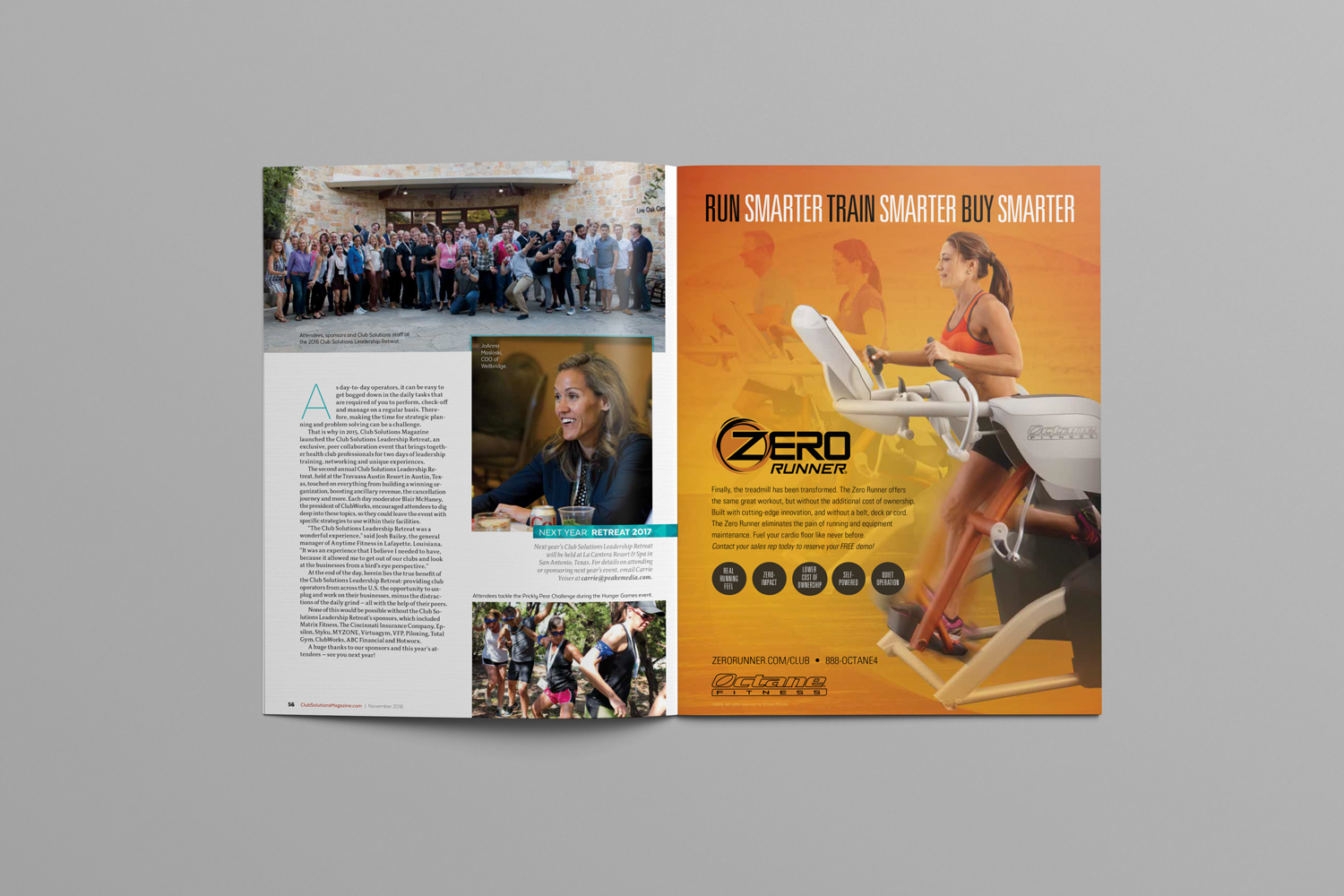
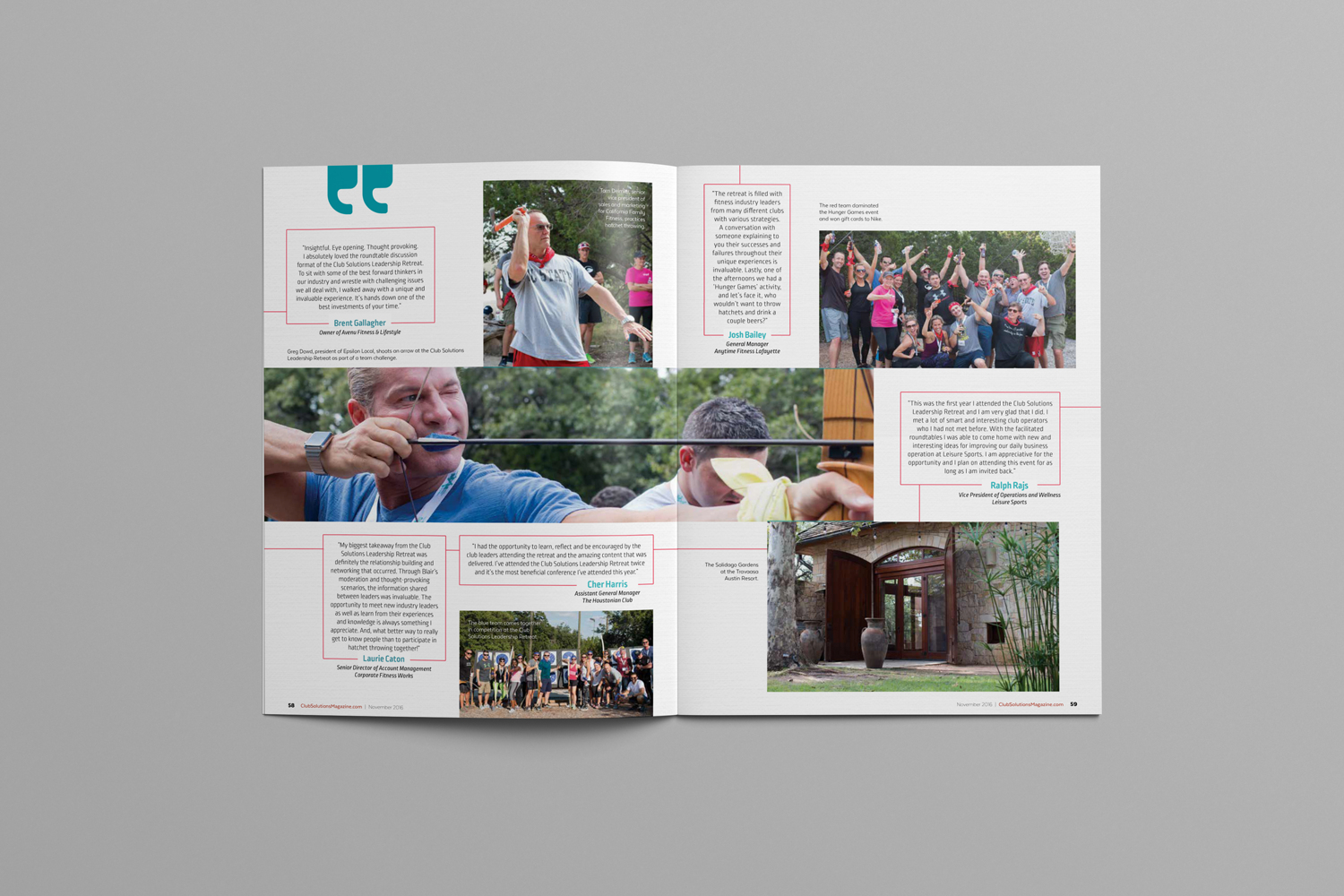
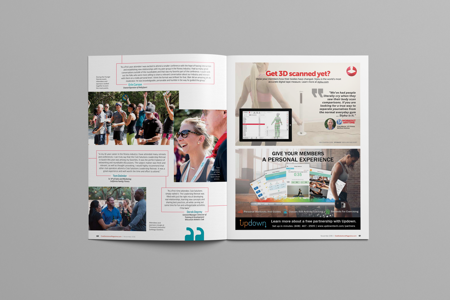
This spread was dedicated to showing one of the magazine's Leadership Retreats through images and testimonials. This is an example of accomplishing a great design with little text and heavy use of graphic elements. These graphic choices I made help to guide the reader through the article while still honoring the color scheme and branding of the event.
Box Pro Magazine
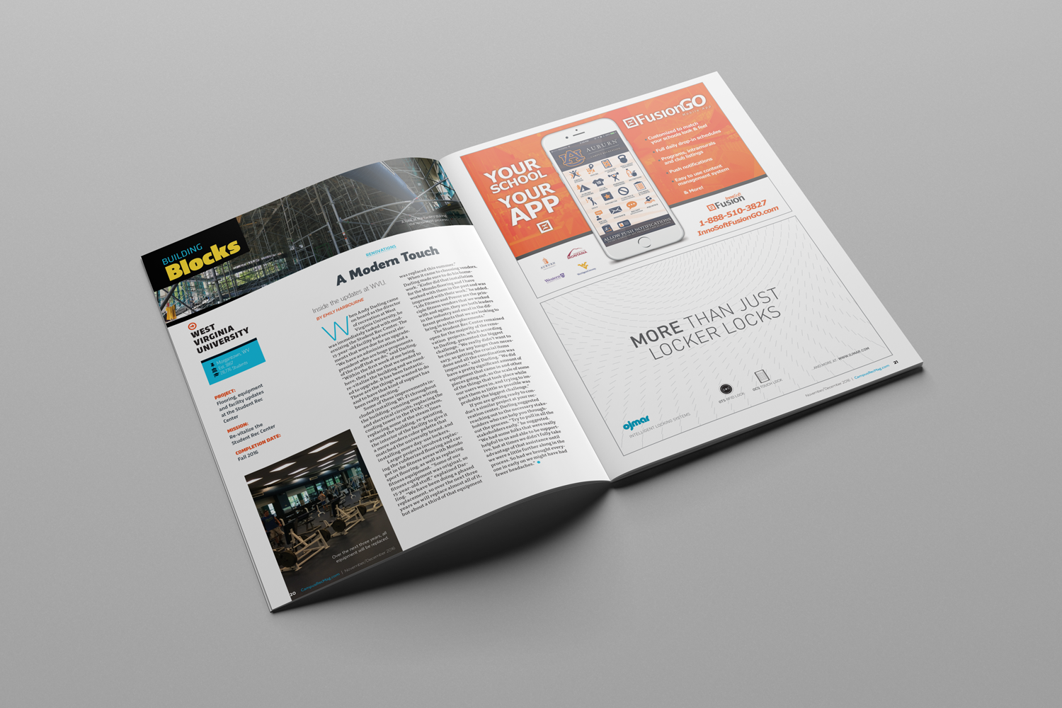
Campus Rec Magazine