
Menu
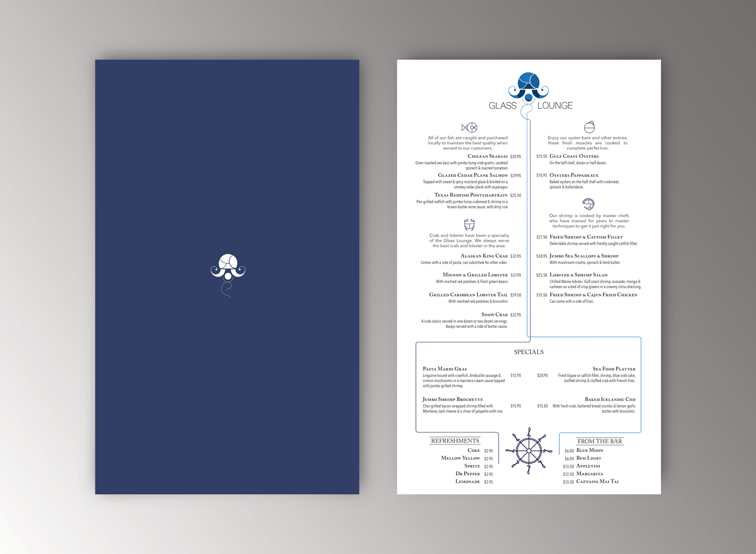
This is a larger image of the menu found in my corporate manual. The logo of the restaurant is the foundation of this design. What I learned most from creating this was that a solid foundation yields a much more effective design quicker and easier. I used the logo to draw the viewer's attention down the page utilizing the menu's unique shape. The same process was employed to make the logo in creating the icons used for the different food groups. This creates a sense of unity which holds the design together.